A good dashboard is mostly the questions you ask before you build it.
In enterprise work a dashboard request is almost always some version of "take the spreadsheet we live in and rebuild it in the new platform," and the reflex is to do exactly that: pour the CSV into a web page, column for column, and call it a day. Nobody pushes back, because it's exactly what they asked for.
Ask what they actually do with that sheet all day, though, and the table stops looking like the answer. Most of the columns are there to be glanced at, not read, and one or two data points are all anyone opens the file for. Rebuilding the grid as-is misses that. If you have an eye for design, you might even try dressing it up with color and animation instead, but it still doesn't fix the problem.
Both skip the real work: shaping the screen around the person using it. The rest of this piece is a handful of tips I've learned over the years, from combining related fields and trading the table for the right chart, to spending color, motion, and type only where they earn their place.
Combine Related Fields#
A database keeps one column per field, because that's how it stores data. People don't read information that way. They'll parse it row by row but more often than not, they'll want related fields grouped together.
The line to draw is between sorting and searching. An address is four fields, street, city, state, zip, and someone might search a zip to find a customer, but no one sorts the list by zip. Search still reaches the text inside a merged cell, so those fields lose nothing by sharing one column. Group them into the thing they describe, and keep separate columns only for what people actually sort by.
| Customer | Street | City | State | Zip | Actions |
|---|---|---|---|---|---|
| Adequate Systems | 1226 University Dr | Menlo Park | CA | 94025 | |
| Reasonable Robotics | 500 5th Ave | New York | NY | 10018 | |
| Nominal Dynamics | 72 Elm Ave | Austin | TX | 78701 | |
| Fair Enough Inc. | 88 Lakeshore Blvd | Chicago | IL | 60601 |
Inside the cell, try to visually distinguish the fields by how much they represent the entry.
For example, in a user list, the name is the identifying factor, so it gets the full contrast. The email is secondary information, so it gets a shade lighter. That way, your eye lands on what distinguishes each entry, while still having the full context of the entry.
Break Free of the Table#
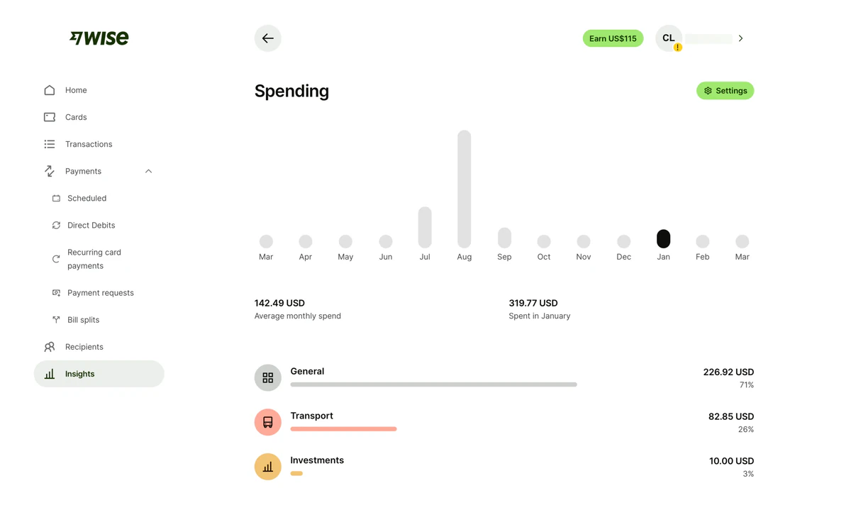
A client once handed me a year of sales as a spreadsheet: twelve columns, one per month, and asked for it in the dashboard. The no-brainer build is a twelve-column table, but nobody reads twelve numbers in a row and sees the trend. They were asking which way sales were heading, and a table makes you work that out in your head. A line chart and a couple of high-level figures answer that at a glance.
Moving to a line chart can feel like you're making the exact figures disappear but you can easily fix this with a simple tooltip. The trend is what you see first and the precise number is a hover away. This allows you to first figure out what needs your attention and then dig into the data that deserves it.
The table is only one shape the data can take. It's the most thorough, but rarely the one that answers the question fastest. Pick the shape from the question, not from how the rows sit in storage.
People comparing two things are better served by putting them side by side, or in a radial chart, than by two columns of digits. When they only care about a single total, lead with one big number and the change beside it, and let the rows that build it sit underneath.
Blur-Test Your Hierarchy#
You've shaped the screen, now comes the time to check that the hierarchy landed. On a simple layout that's easy to eyeball, but pack in cards, a table, a chart, and a toolbar and it's hard to tell what your users will see at first glance.
One quick hack that I've found is just to blur the whole thing. Add a blur on the page, and you're effectively reducing edge and color contrast. Whatever elements still remain clearly visible after blurring are the ones that will stand out first.
Inversely, when too many elements survive the blur, they're all competing for attention. This means your hierarchy is too flat and the eye has no idea where to look first.
If the thing that survives is the one you wanted noticed, the hierarchy works. If not, something is pulling focus it didn't earn. Most of the tips ahead are about fixing that visual noise in dashboards.
Let Some Actions Stand Out#
Actions are usually the first thing you'll catch competing for attention. It's easy to think that every action deserves to be important when you're the one building them, but when you do that, you end up with rows of equally loud buttonswith no obvious place to start. The overcorrection is just as common. You strip the labels to quiet things down and you're left with a line of bare icons that don't mean anything.
What helps is ranking the actions before styling anything: how often does someone reach for this, and how much does it matter when they do? From there the styling mostly writes itself:
- Primary Buttons should be reserved for the single primary action the page is built around. If you need more than one, that often means you're building the wrong screen or they're not primary actions.
- Secondary Buttons are still important, but not the main event. They stay full-size, but muted (outline or ghost) to keep them from competing with the primary action. You generally shouldn't have more than a handful of secondary actions on a screen. Try to keep them to one or two per section.
- Utility Buttons are generic actions that are still useful to have at the top level. These should be muted icon buttons with a tooltip on hover labeling the action. Never assume the user knows what an icon means.
- Everything else goes in a kebab or in a context menu. Nobody minds digging a little for something they use once a month.
Keep in mind here that we're not talking about removing actions to acheive our hierarchy. We're just ranking them based on how often they're used and how much they matter when they're used.
Be Mindful of Color#
Color is one of the best tools you have for grabbing attention, and dashboards tend to spend it everywhere. It can be tempting to use bold colors for the headers, use color to help differentiate secondary statuses, colors badges in the table, etc. But when you do that, pretty soon your dashboard ends up looking like a bag of Skittles. When everything is colored, color stops meaning anything, and the one state that actually needs attention drowns with the rest.
Color reads best when it marks a decision that the user needs to make. An overdue invoice deserves red because someone has to act on it. A paid one can stay gray text, no pill, since paid is the state nobody worries about. The same goes for actions: a permanent delete warrants red, a reversible archive doesn't. If seeing the color doesn't change what the user does next, it probably doesn't need to be there.
| Rep | Role | Status | Conversion |
|---|---|---|---|
| Dana Whitfielddana@northwind.co | Lead | Offline | 12% |
| Marcus Reedmarcus@northwind.co | Senior | Working | 34% |
| Priya Nairpriya@northwind.co | Senior | Working | 41% |
| Tom Alvareztom@northwind.co | Junior | Working | 8% |
| Sofia Kleinsofia@northwind.co | Junior | Offline | 27% |
This is one of the things the blur test catches best. Color survives blurring better than almost anything else, so a quick blur will show you every badge shouting about a state nobody acts on. Strip those back to plain text and the few colors you kept start doing their job again.
Animation as a Reward#
Animation is usually thought of as a sign of craft, and now with LLMs, it's has never been easier to add (or overdo). Most UI libraries ship with springs and fades built in, so everything ends up animated by default. On a marketing site that's fine, a bit of choreography makes the product feel alive. But on a dashboard, your users aren't looking for delight, they want efficiency and every millisecond of animation in their workflow is a drag.
However, that doesn't mean stripping every transition out. It means reserving motion for the moments where it communicates something: a skeleton that says the page is loading and not broken, a success state that confirms the payment went through, a subtle pulse pointing at something that changed while you were looking elsewhere.
Motion works best as a small reward after an action, not as performative art standing between the user and their next click.
Text Is Not Decoration#
Type does a different job on a dashboard than on the rest of your site. There's barely any prose to set: it's numbers, IDs, dates, and labels, packed into tables at small sizes, and each one has its own way of failing when you style it like body text. Give each kind of content the treatment it needs:
- Numbers want
tabular-numsat minimum, so every digit gets the same width and columns line up. With proportional figures, $1,111.11 takes less room than $999.99 and reads smaller at a glance, even though it's the bigger amount. Right-align them too, so the tens sit over the tens, and leave text left-aligned. - Dates and time want a single, unambiguous format. 06/05 is May or June depending on who's reading, so spell the month out. This also has the bonus effect of making the date shape easier to parse. Relative time like "2 hours ago" or "Yesterday" works great in time-sensitive lists, but always think to tuck the absolute value somewhere for anyone who needs the paper trail.
- IDs, hashes, and codes read best in monospace. The fixed width makes two values that differ by one character actually look different, and a good mono draws 0 and O, 1 and l apart, which matters when someone is copying a code over the phone.
- Labels and column headers are furniture, not the content. Keep them small, muted, and identical from screen to screen, so the eye learns to skip straight past them to the data.
- Reading text does best in a sans font with a tall x-height. Keeping tracking wide at smaller sizes will help legibility. Dashboard type spends its life between 9 and 14 pixels, and plenty of fonts that look elegant at forty turn to mush down there.
Some of my favorite open-source fonts for this use case are: Geist, Atkinson Hyperlegible, Sora, DM Sans, and Manrope.
Type on a dashboard is a legibility decision before it's a brand one.
Accompany, Don't Teach#
By now you've mostly completed your app, all the features are in. Then comes the request for an onboarding guide: the five-step walkthrough that grays out the screen and points arrows at features you haven't even used yet. Everyone loves it in the stakeholder demo. Actual users? They spam Next until it goes away and remember exactly none of it.
The thing is, a tour answers questions nobody has asked yet. Someone on day one doesn't care about the reporting suite or where the export button lives, they signed up to do one specific thing and the tour is standing between them and it. You end up optimizing the first five minutes of your app at the expense of every day after that.
The better move is to accompany instead of teach. Answer the questions when they actually show up: a tooltip with some extra context the first time someone hovers an action they've never touched, an empty state that says what goes here and how to add the first one, a small popover in the corner when a new feature ships.
This list could go on for a while and if I'm honest, none of these are groundbreaking. Merging columns, muting a badge, dropping an entrance animation: afternoon changes, mostly. But the payoff is far bigger than the diff. Your users sit in these screens all day, and every bit of noise you cut is something they feel every single time they come back.
The hard part is keeping it that way. Every request for one more column or one more status color sounds reasonable on its own, and each one makes the screen a little louder. Blur the page now and then to catch the drift, and come back to the question this whole piece started with: What does this person actually do here all day?
The answer is never "they come here to stare at a table.", because a good dashboard is never just about the data.
It's always about what people do with it.